Objective:
Rebranding Menaud Ready-to-Drink Cocktails
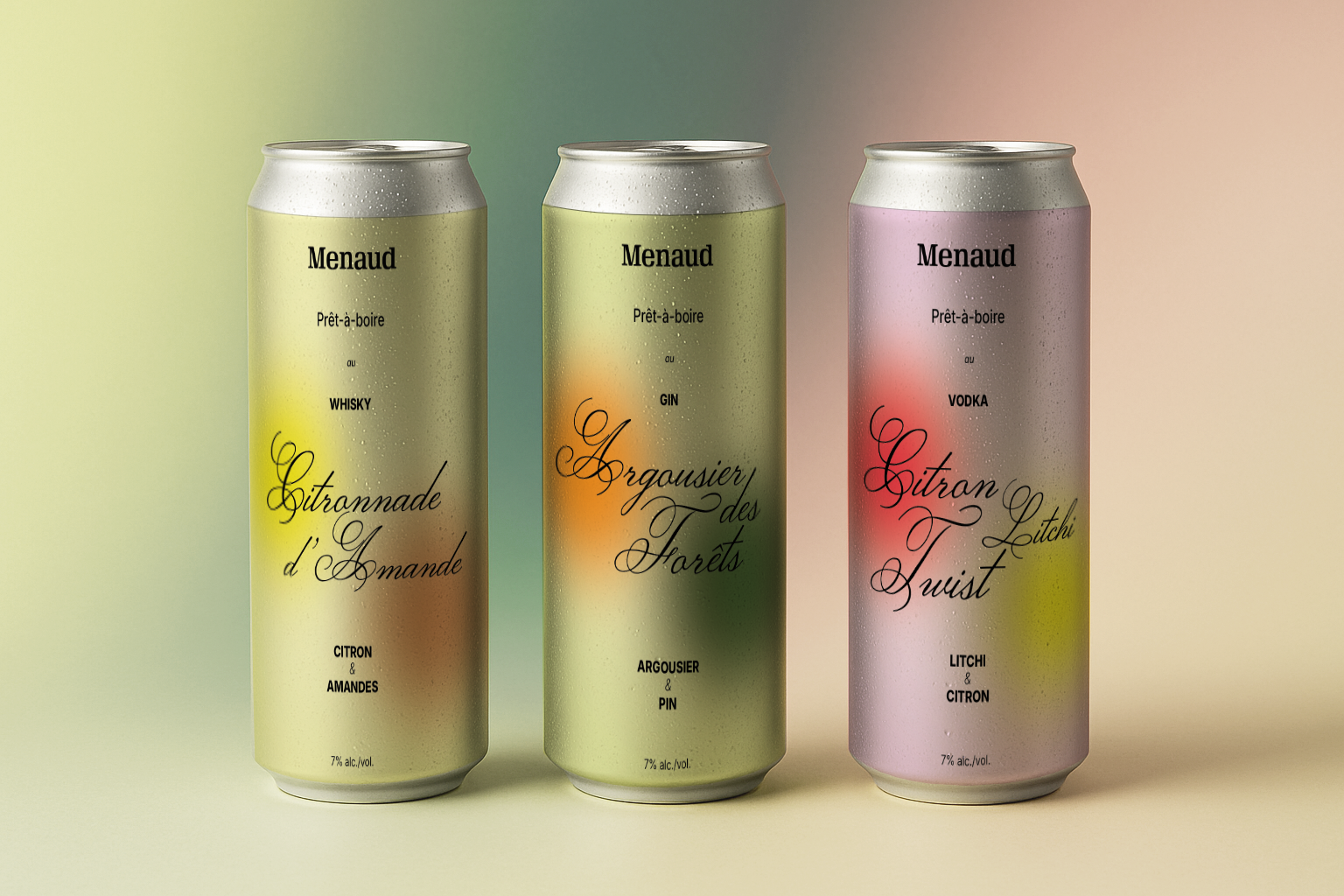
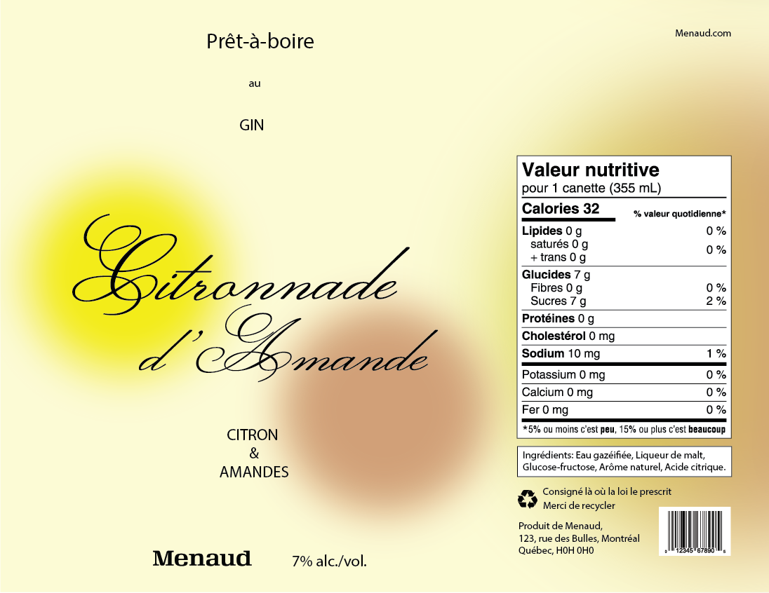
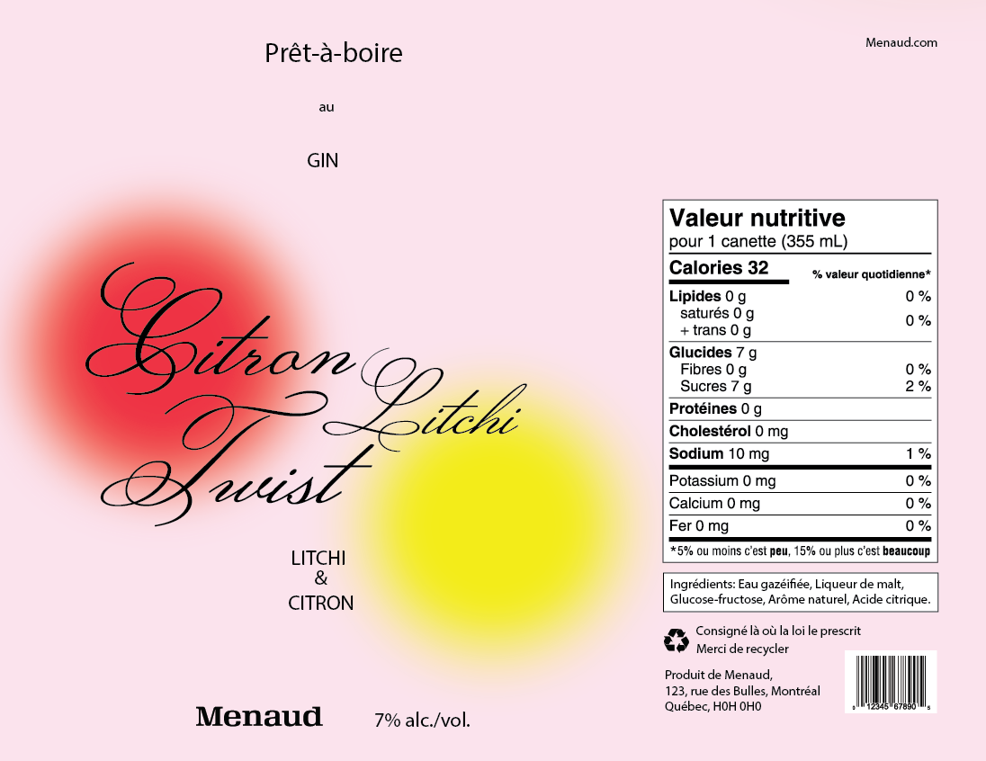
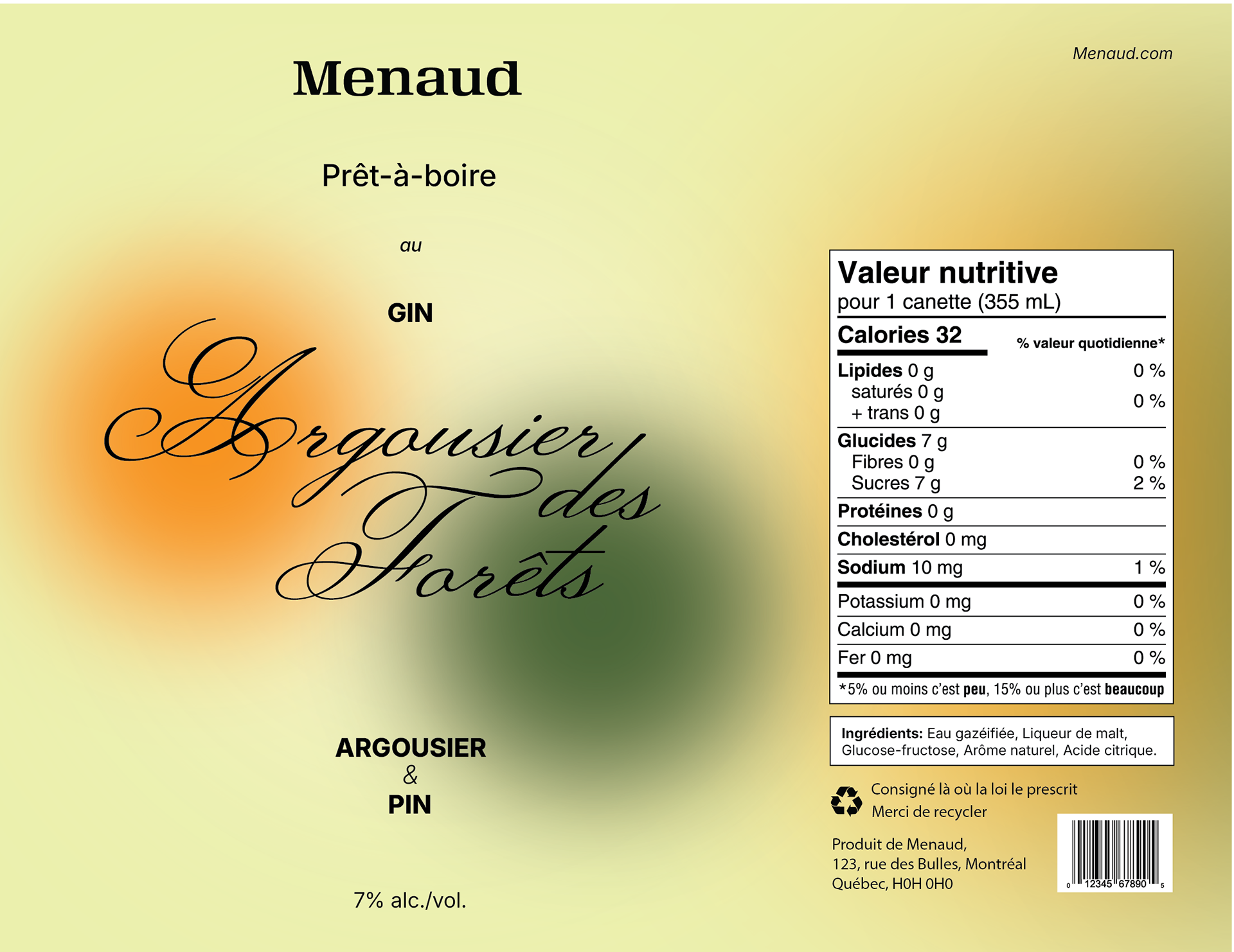
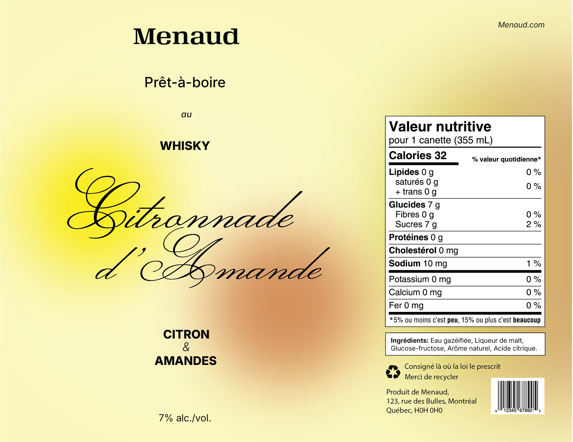
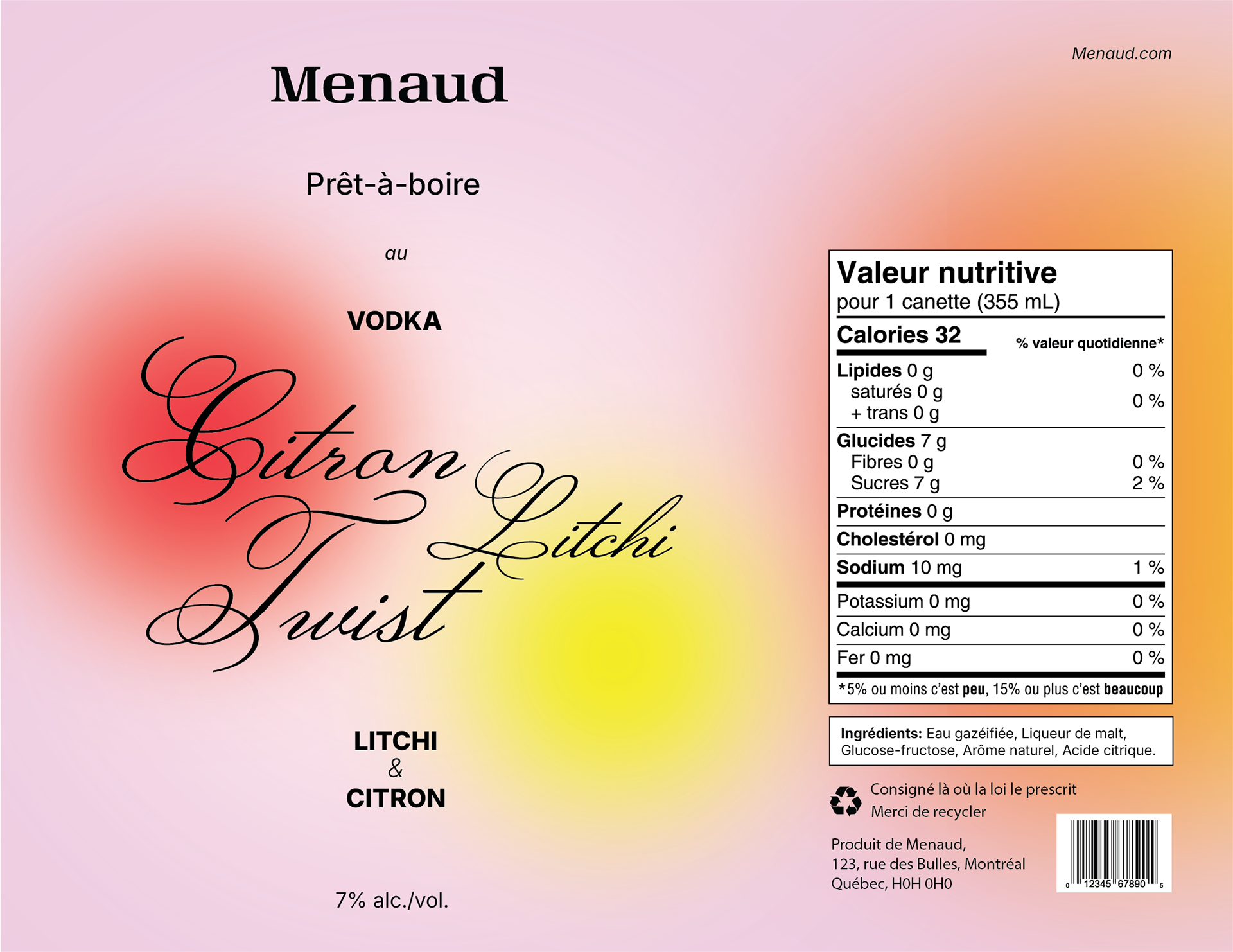
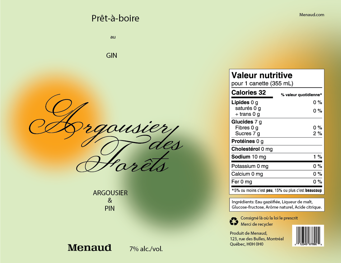
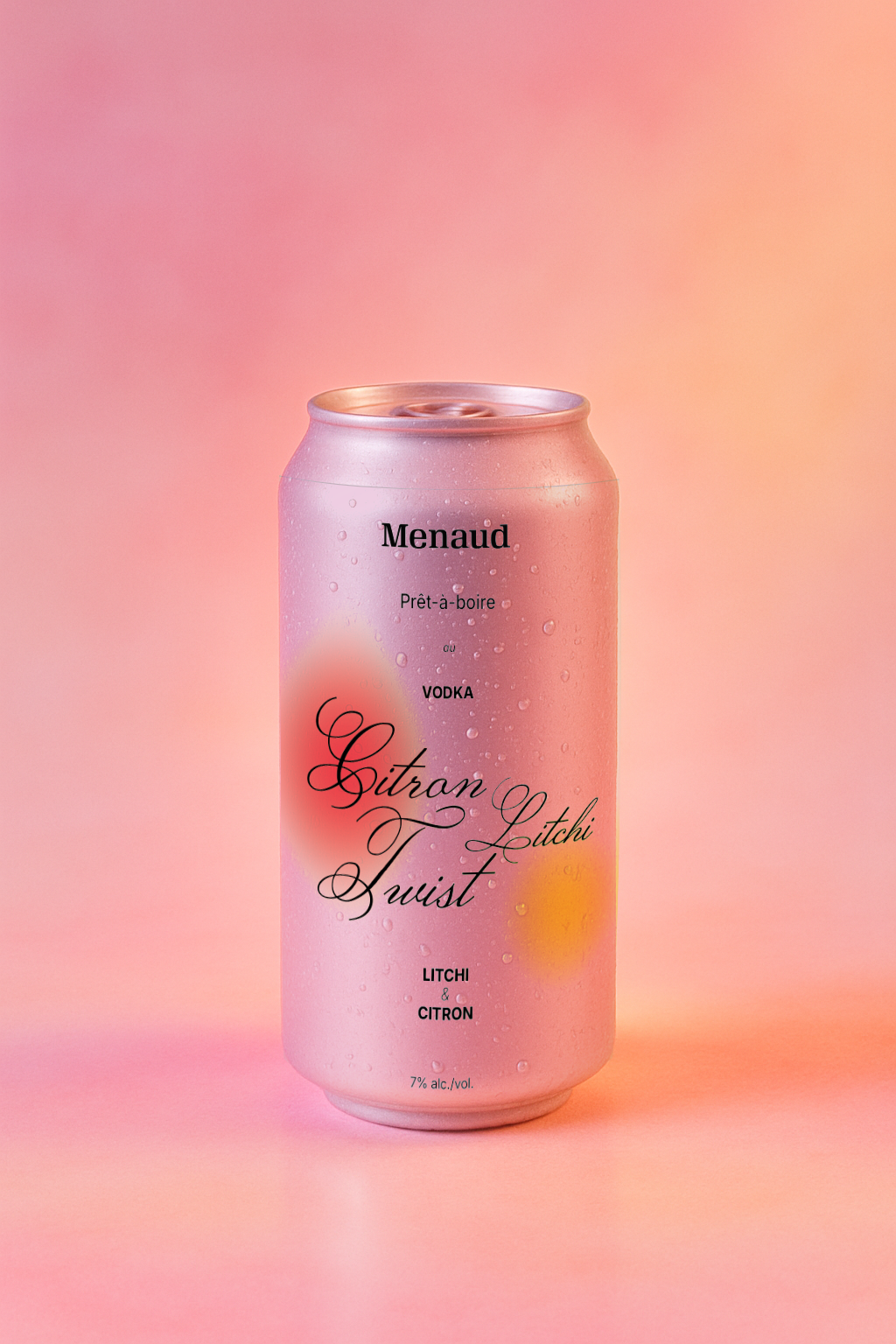
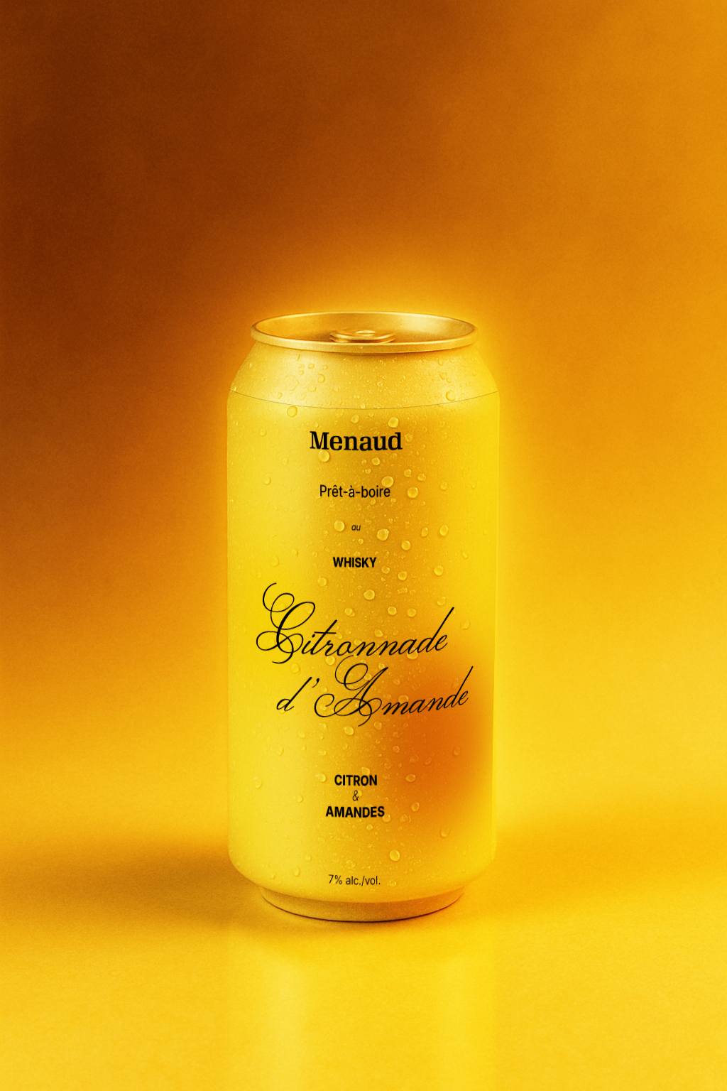
This project was part of a school assignment to revisit the visual identity of Menaud’s ready-to-drink cocktail cans. The goal was to create a more eye-catching and emotionally resonant design that would better connect with a younger, design-savvy audience.
This project was part of a school assignment to revisit the visual identity of Menaud’s ready-to-drink cocktail cans. The goal was to create a more eye-catching and emotionally resonant design that would better connect with a younger, design-savvy audience.
Menaud is a Quebec-based distillery known for its premium, small-batch spirits. While the original design targeted a more mature audience (ages 45–65), this redesign aims to reposition the product visually to resonate with a younger urban clientele.
Typography:

Tests:
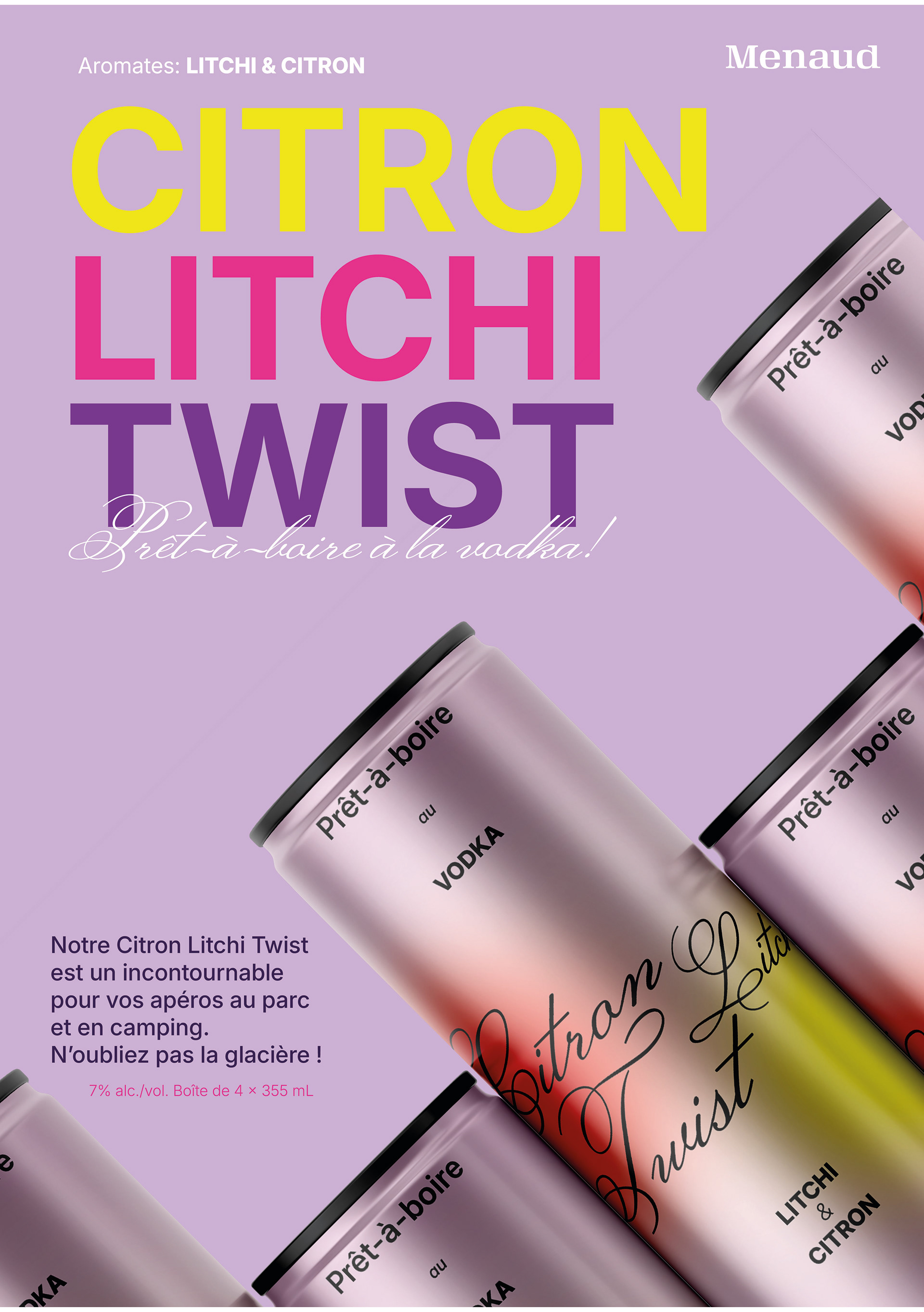
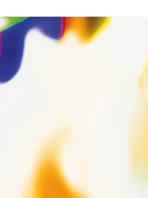
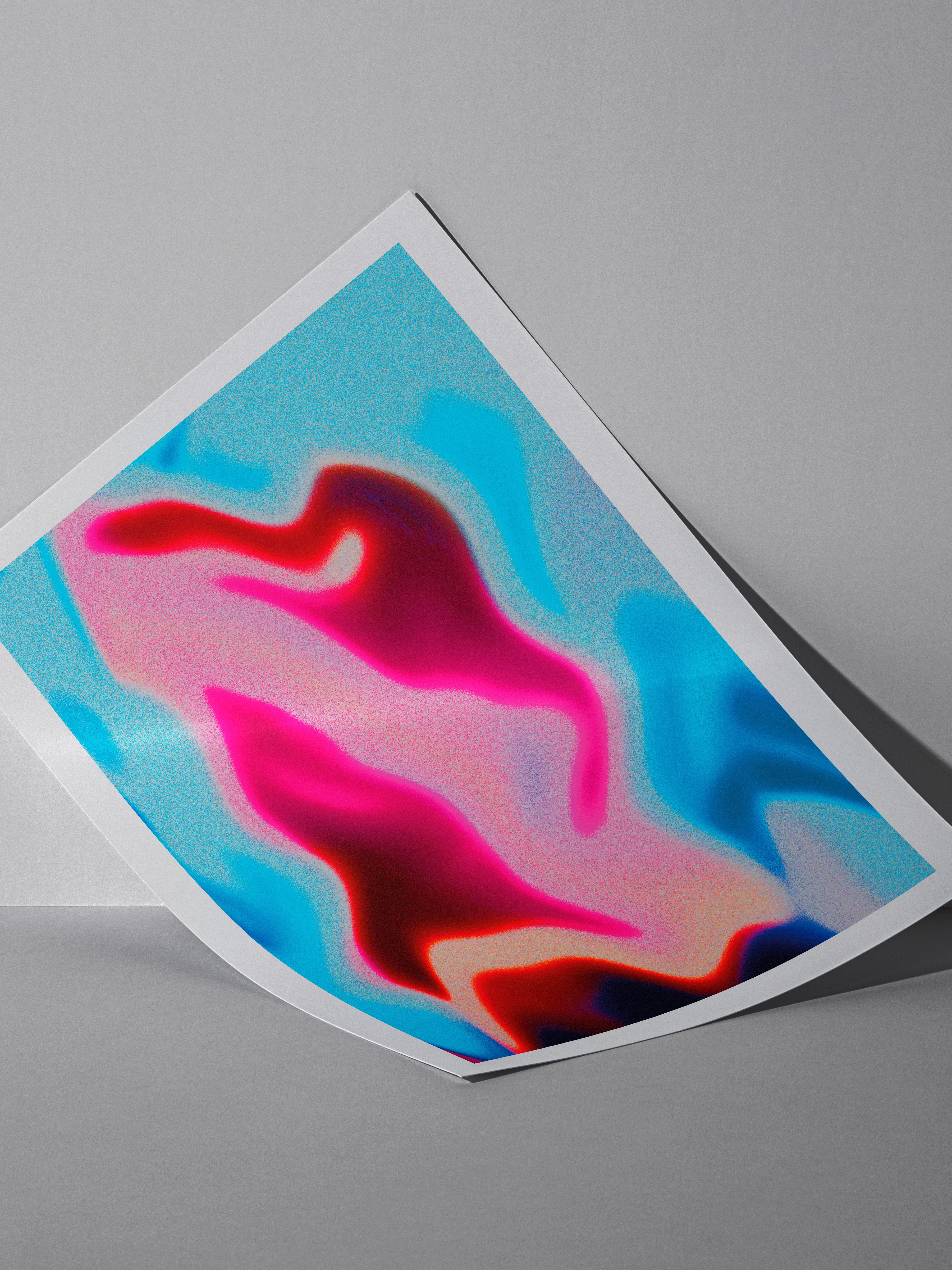
Alternative ideas for a potential promotional campaign.
Keywords: Dramatic studio lighting; Vibrant gradient tones; Soft transitions; Light water droplets; Cold effect; Glow; Abstract; Dreamy movement; High-fashion editorial look; Glossy finish; Soft noise grain texture; Photography modern retro; Advertisement from the 80s; Futuristic lighting; Cinematic; Soft reflections; Playful, Luxurious, Minimal vibe

Thank you for watching!